The Zorn Limited Palette
Anders Zorn (1860-1920) loved telling the story of ordinary people. His paint was fleshy and his flesh, painterly. His preference for unembellished pigment was congruous with his lifelong fondness of humble folk life and nature.
1887 was the year that Zorn first picked up oil painting, using a color palette rapidly losing favor among his Impressionist contemporaries. This was a period of discovery in optics, chemistry, and perception. Shockingly bright pigments, unimaginable to old masters, had arrived on the scene and flooded the market. A revolutionary use of collapsible tin tubes for storing paint and extending shelf life allowed artists to take their work outdoors. Paint-makers raced to keep up with artists’ demands. Painting was becoming increasingly accessible and artists were taking full advantage of modern innovations. Adapting to changing conditions in setting, subject, material, and philosophy resulted in attitudes and techniques transforming into the style we call Impressionism. Brushstrokes were loose and varied, subjects were lighthearted, and color itself took center stage. Finally equipped with pigments offering a wider gamut of intensity, how could one stay indoors and not try to capture the full spectrum of natural light? Palettes were stripped of black, while cadmiums, emeralds, and cobalts replaced dull umbers and ochres. Bejeweled canvases glittered with dappled paint and glowing sensations of transient light. Color became a tool of the avant-garde, and it was applied thickly and rapidly.
Zorn Watercolor
Zorn Watercolor
Imagine being an accomplished artist, having achieved miracles of light with watercolors, and having access to so many of the amazing new pigments in oils, but not using them. This is exactly what happened with Anders Zorn. When he finally set his sights on the luscious medium of oil paint, he avoided the new technology and began using pigments associated with cave paintings and an ancient color strategy preferred by Greek artists in 300 BCE. These stylistic choices were influenced by Zorn’s independent study and travels through Europe. He befriended artists of various backgrounds, learning from them, and on one such occasion, he met the man who suggested painting in oils with these humble pigments. We may have never been gifted with Zorn’s manipulation of color using this palette had he not met American artist, Edward Simmons, while they both happened to be working in St. Ives, of Cornwall, England. Simmons was the one who suggested Zorn start with Ochre, White, and Black. Zorn later added red and used it as his dominant color. This condensed palette makes sense when starting in a new medium. Many students beginning their foray into color start by limiting it. But why did Zorn not abandon it for the brighter Impressionist palette? Why did he choose to restrain himself in this way? After mastering oil, he could not have been intimidated by stronger pigments, especially after capturing such luminous effects in watercolor. So why did he persist in its use?
Having to choose between a brilliant set of scintillating color or a rusty group of, essentially rock and charred bone for pigment, I think most of us know which we’d want. How many times have we salivated in the glorious aisles of art supply stores, shamelessly grabbing tubes of every hue? It’s difficult to resist such sensuous temptations, especially when all the work of mixing specific shades has been done for us. But how many of us can also attest to the dreaded aftermath of squeezing out a kaleidoscope of color, hoping to achieve enchanting canvases of Tiffany-style beauty, only to see our brushes dipping into piles of uncontrollable paint, feverishly trying to cover up screaming patches, eventually left with a muddy mess?
It brings me back to memories of being a little girl, staying home alone with my brothers for a few hours, waving our hands sweetly while our parents’ car pulled away, and at once jumping up to have fun—them racing to play video games and me to my mother’s stash of makeup. Proceeding to experiment with every tint, smearing my face in conflicting hues, and finally prancing in front of the video game screen, I only received looks of horror from two boys less-fazed by the creatures in their games. My little sister, who dresses so smartly now, would also experiment with different outfits, sometimes mixing so many articles of mismatched clothing, she made halloween look orderly. What is aesthetic maturity? Is it simply a sense of balanced restraint and agreement between parts? If we didn’t develop this sense, I wonder how many of us would carry closets around our waists. Making pretty paintings is not made easier by using pretty paint, and getting things right requires a counterintuitive resistance to variety.
The first decision we make regarding our palette is very important. Selecting the colors we lay out will determine how clean or muddy our mixtures will be. To achieve more radiance in your paintings, select single pigment colors instead of pre-made mixtures like “flesh tint” or anything with the word “hue”. With the many manufacturers of paint today, it is easy to unintentionally overcrowd our palettes with redundant and unnecessary color. Many colors are actually mixtures that include more than one pigment. If we lay these colors out, we start with pre-muddied mixtures that will only become more dull when mixed into other composite colors. It is important to read the labels on paint tubes to see how many and what actual pigments are included - pay attention to the color code as all manufacturers must list it in accordance with the universal pigment index. Be wary of companies that fail to disclose this information. To deliberately obscure or withhold it, showing “proprietary mixture” in its place, is a disservice to artists and a suspicious practice.
To achieve purity of color, it is wise to make your own mixtures using no more than three individual pigments. If you aim for pigments that, in their unadulterated state, are already close in value, chroma, and temperature to the halftones of the subject, less mixing will be required. Achieving tonal variety should rely on careful adjustment of ratios instead of piling in more paint from other tubes. Understanding how each pigment reflects and refracts light is also helpful when considering things like which white to use.
It is important to distinguish neutrality from dullness. Neutralizing hues to capture the muted tones of flesh is exactly what we want. Dullness is the undesirable result of having too many pigment particles in a mixture, causing less light to penetrate through the paint film. That lack of luminosity is what causes the dreaded “flat” look. Flattening color in this way defeats the purpose of using oil to begin with. We can enjoy muted tones while still retaining richness and depth by selecting semi-opaque colors that are naturally muted. Mediums also play a role, but more so in indirect painting when glazing multiple layers.
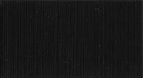
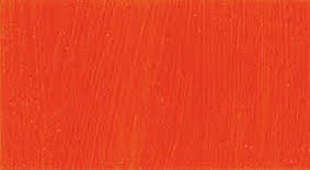
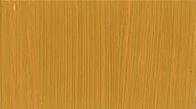
In Zorn’s extremely purposeful selection, each pigment has a distinct role and identity. The palette is balanced and organized, reducing competition among the colors. It offers a natural hierarchy of structure and is wonderfully suited for flesh. The colors are:
The pigments of the Zorn Palette have an inherently lower chroma than most modern synthetic pigments. Although Cadmium Red Light and Titanium White are brighter and more opaque, they are also cheaper, more widely available, and less toxic alternatives to Vermilion and Lead White. You can buy these pigments at any art supply store or online.
The Zorn palette is a selection of colors closely calibrated to the specific chromatic conditions commonly observed in figurative subjects with indoor light. In order to create convincing flesh tones, we must neutralize the chromatic intensity of our strongest hues. So, if the brightest yellow we see in our subject is a glowing forehead, there is no point of squeezing out a cadmium yellow only to use three other colors to try and mix it down to a mellower state.
Keeping it simple and elegant, White and Black are the only options available to bring colors into the upper and lower registers of value. As Yellow and Red occupy a space in the middle value range, White and Black are used to create tints and shades. The gray they produce when mixed, takes on a cool enough appearance to create the impression of blue - especially in relation to the two warm colors. When mixed with the other pigments, they gently dial back chromatic saturation, essentially reducing a color’s intensity. You can pre-mix strings of several tints and shades for each color to make direct painting move faster. Ivory Black is semi-opaque making it gentler than something like Mars Black when used to mix greens and purples.
Yellow Ochre is a mild yellow compared to the more popular Cadmium Yellow—it does not scream as bright and is lower in temperature. Its hue identity is therefore subdued and will gently shift mixtures without overpowering them. As an earth color, it has a muted warmth that is truer to our own natural skin tones. As the strongest presence of color appears in the middle values, Yellow Ochre can be used throughout, with Vermilion adding punch for the hottest moments. When mixed with black we see greens perfect for flesh.
Vermilion is the warmest, slowest drying, and most opaque pigment on the palette. It throws a substantial punch when capturing the heat from our skin for added force and vitality. The chromatic hierarchy of the Zorn Palette is sensible for painting people, especially as red is the color that draws us in the most, and can be reserved for halftones, reflected lights, and areas of lively color where blood flows, in tear ducts, cheeks, and lips. It is useful not only in skin but also for leading the eye with striking accents, like a ribbon or pin. The red can even handle large masses of area, as it is easily softened with -or balanced in relation to— other lower tinting colors. When mixed with black it produces a wonderful purple.
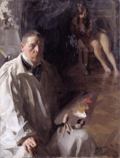
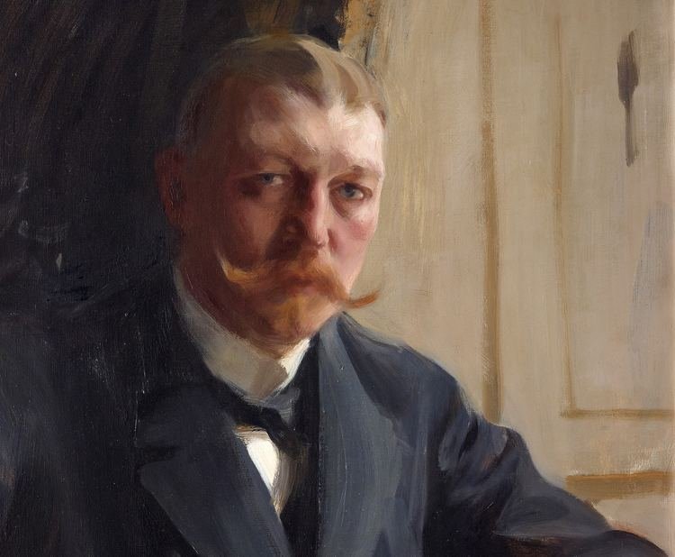
Zorn Self Portrait - notice how small the red accent is, yet has no problem being seen. The perfect balance and arrangement of color and shape. This requires organization and clear intentions.
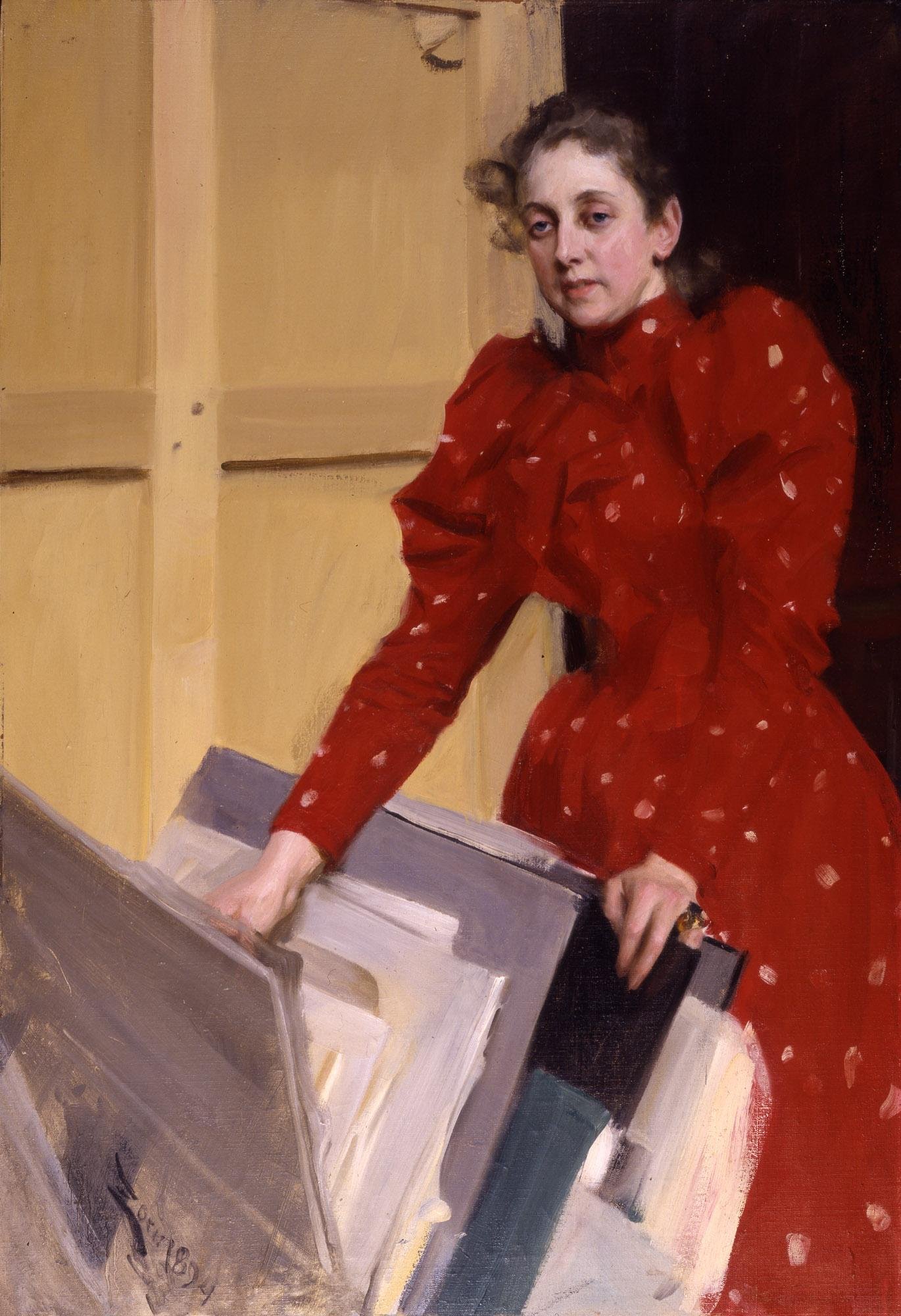
Zorn’s Wife In His Studio - notice how much red there is without overwhelming the scene. Such solid, deliberate, and pleasing design! Perfectly distributed, all parts belonging, fitting like a puzzle,
As you can see, Zorn does not starve his palette of paint, or impoverish his color. Rather, he creates complex tones through subtle shifts in ratios. Zorn did not avoid bright colors for a lack of taste, but probably enjoyed weaponizing his palette against indulgence and lazy mixing. Too much conveniently available color leaves us with less to defy and overcome. The challenge emboldens our decisions and leads to inventive solutions.
With the unique challenges of oil, perhaps Zorn also found relief in the limitation of color. Very different from watercolor, working with harmonious grays gave him a chance to exploit the medium’s viscosity and play with levels of thickness and transparency. He learned when to let the canvas breath and where to lay it thick. Many of his paintings were done in a direct, wet-on-wet, or Alla Prima style. He laid in broad masses of color, working with his largest brushes first, building smaller planes on top. This sequence is the only way to organize the process efficiently. He saved the brushiest gestural accents for the end, applying broken strokes on top of dry paint.
Notice the pure red accents
I have discovered that you really need to be careful when using the Zorn palette. It is not as simple as using these pigments and then enjoying the outcome; it takes a surprising amount of focus to implement. Try to avoid chasing the colors you see. It is not possible to copy colors exactly as they appear - the attempt to do so is rather futile with any palette, Zorn included. Pigment is itself a limited medium that can only evoke our perception of colored light through relative, rather than absolute relationships.
Putting the Zorn palette into practice is the best teacher of its uses. On one hand, the palette minimizes color’s role, allowing value pattern, drawing, and edge quality to take precedence in our design. At the same time, by using these spare unmixed colors, we are forced to spend more time mixing distinct gradients for transitions within and between passages. Creating these mixtures greatly develops our sensitivity to color. Thanks to the relative weakness of all the pigments, they can even be used alone without overwhelming an area with their presence.
One of the many advantages I have encountered while using the colors is their effortless unity. Palettes overloaded with provocative color can clash when too much “fighting” occurs. Having little cohesion and agreement between parts is distracting and makes it difficult to focus on intended areas of interest. By having only three colors plus white, it is more likely that mixtures will share at least one common ingredient. This gives us more control in drawing attention to important passages, while reducing the potential for chaotic bombardment and jarring separateness. Limiting the total number of pigments simplifies decision-making. In the Zorn palette, Black offers gravity and weight while Red offers intensity. They can each be distributed throughout the composition and assigned roles that create balance. The tones surrounding them create harmony.
Somehow we are always surprised to discover too much of a good thing. Like moths to flame, it would do us good to realize that uniform brightness throughout a canvas becomes an assault on our senses. If you can’t control yourself, try introducing a new color to your limited palette only after successfully completing several works using the few. Get to know your colors and how they behave so that mixing is second nature. For if there is any intelligent conversation to be heard within a painting’s design, the chaos of cacophonous hue will likely drown it out. Instead of increasing the total number of bright colors, aim to maximize the effects of one or a few, by implementing a color scheme. The key to achieving pleasing results comes from balanced ratios and selective chroma. Paint with a formula in mind. For better color management, try completing initial poster/color studies before experimenting on a final work.
With our palettes sobering up in the refined, but “gray”, company of the Zorn quartet, what will help us achieve dramatic tension and opposition? Let shape and value design take the wheel. Dynamic color relationships can still exist but require careful calibrations and force us to pay closer attention to temperature relationships. Composing a painting with this palette feels more like setting up magic tricks. You will be forced to look not only at the model, but consider their surrounding, needing to involve background more than ever. The palette encourages us to pay more attention and enables us to create more complete compositions, integrating our subjects within their space. In a way, it’s a more egalitarian design process.
Most of the time Zorn’s brush went straight to canvas with no buffer of charcoal or graphite beneath. The deftness with which he wielded a brush, the confident spontaneity in his strokes were founded upon his tireless devotion to drawing and rendering through value and line. Intoxicating as color is, Zorn’s wisdom was in maintaining these priorities as a painter. Unlike many Impressionists around him who singularly pursued capturing pulsating sensations of chromatic light, he never let color reign over drawing. His color can be strikingly beautiful, but never to the detriment of form. His first experience with art was sculpture - I am sure this sculptor’s sense of form helped him imagine carving and modeling planes with paint.
Notice the sculptures in Zorn’s studio.
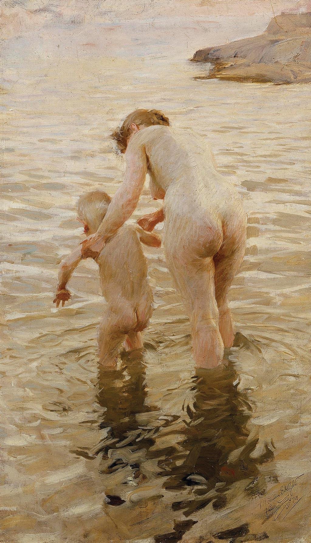
Etching-like strokes wrapping across forms.
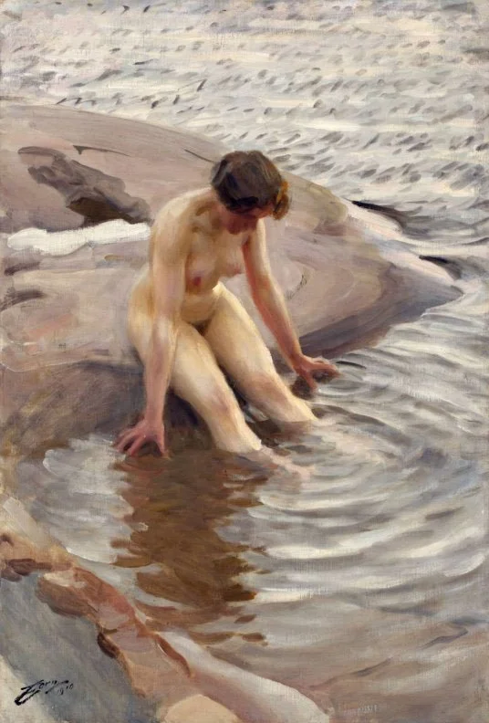
Zorn's preparatory works include pencil sketches and color studies to help him plan his compositions. We cannot exclude these when considering how his visualization process helped him achieve the effortless look of his richly complex paintings. Every medium he worked in contributed to the unique look of his oil creations. When studying his watercolors and etchings, his powers as a draftsman become abundantly clear. Don’t get the wrong impression from his bravura brushstrokes in oil paint. He was extremely meticulous about getting even moving ripples on water absolutely right, sharp, and in perspective - a devotion to accuracy that would impress Eakins. More interestingly, it seems that Zorn valued precision as much as he valued innovation. He would often make etchings based on already completed paintings, constantly challenging himself to find alternate ways of piecing elements together. This insatiable playground of an imagination is what I admire most in him. The endless pursuit of possibility and love of problem solving. (There is never enough time and space in a single post, but I go into more depth in the online Zorn class as well as others.)
Exploring the subject with line offers a more complete understanding.
Preparatory color studies help test ideas before committing. The more work done at this stage, the faster it goes in the final.
Solid preparation pays off, allowing Zorn to execute the final painting with ease.
It is important to note that Zorn did not exclusively paint with only four colors, but that they served as the leanest possible grouping, making them the core that held his works together. Other pigments were added when necessary, but these four are so reliable and work so well together, there is often no need for more - especially when painting indoors on nothing brighter than rosy lips. As we know, drawing, values, and edges largely determine the success of portraits and there is a much smaller margin for error in such work. So, the less we struggle with our palette, the more we can concentrate on those neediest of issues. With the many variations for limited primary color palettes, Zorn’s combination is particularly appealing for its subtlety, quiet complexity, and modest but straightforward character. If you want to focus more heavily on color, it is better to choose an outdoor or non-figurative subject.
It is clear that Zorn relied on additional colors quite often (I will cover this in another post), and although we can guess which paintings were made using the limited palette, we can’t be certain without x-ray analyses. So why is his name still so strongly associated with the palette? I think he started the rumor himself when making this self portrait:
Zorn’s self portrait with palette in hand.
The scene portrays the artist with his model - taking a break between poses. She covers up and rests, or waits for us to leave. It is a view of the model we rarely see; she is not central. Is the virtuoso showing off, suggesting he casually completed the work in the interim between poses? Is that a cigarette he is holding? Is he cockily suggesting the painting could be finished before his cigarette? Is that a testament to his skill, or to the power of his tools? Who is the message for?
If you look closely at the palette clearly on display, its placement in the composition, its position in space, its careful execution - it almost seems like a portrait of the palette. Zorn is stating it himself, as if speaking on its behalf, as advocate and ambassador, suggesting that these age-old pigments are not only instrumental, but key to his work. The palette leads us directly to the model behind him. The dynamic movement between all the elements, relegating the strongest color to the pigments themselves. The cascade of light landing upon the folds of his formidable smock, the strong and striking contrast in the fold of his sleeve, all reaching for the palette and telling us to look there. He seems to be giving them a place of honor, saying, without opening his mouth: “Listen up, insatiable hedonists, slaves of color’s delight: these are the stars of this painting. Expand your mind, not your palette.” Of course, he is sharing the frame with the palette while holding a cigarette (or brush) in his hand. He poses the way he paints; with authority and ease - showing us he has overcome the challenge presented by the medium and by the art world, too. Thanks to these pigments, his faith in, and work with them, he is worthy of posing beside them.
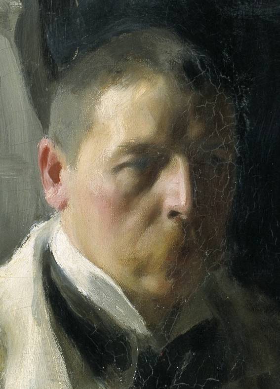
This is my interpretation. If at all true, it’s an admission that begs our attention, for it is stated in some of the finest language he possesses. To proclaim this so boldly in the midst of an Impressionist revolution. The seriousness with which he paints his own face here, the patience and sensitivity it requires - I believe it to be one of his most evocative and mysterious self-portraits. Each individual pigment is arranged on his face, mirroring their order on his palette, all quietly reverent and amplified by his form’s shadow - which seems to stop where the palette emerges from it. What an insightful way of suggesting their bond. Where the colors are, there is light. The range of touches and caresses gliding across the surface reframe the merits of this rusty palette in some of the most persuasively seductive passages. A union of forces.
I believe Zorn feels indebted to these pigments. I have not found any other self portraits where he reveals and highlights his material in such an obvious way. Perhaps we all honor Zorn for bringing our attention to this palette, because he himself placed so much importance on it at a time when novel temptations threatened its obsoletion.
Such a subtle use of color. It isn’t “easy”. Instead, its quiet presence forces us to really listen and put in the work of hearing its music.
Notice the systematic arrangement of color according to value. It looks to me like there is a fifth pigment camouflaging between the red and black (top right) - perhaps a burnt sienna or umber. As you can see, it has not been dipped into much.
It is fun to try as many combinations of a limited palette as we can. Zorn’s palette is only one way, and even he tried variations. We should avoid following prescriptions or formulas in a dogmatic way - he was never one to do so and viewed nature as the greatest authority. Remember to balance disciplined practice that follows the wisdom of masters with your own curiosity, imagination, and experimentation.
While there is nothing particularly extraordinary about the Zorn colors, he maximized each pigment’s potential, and used their limitations to unlock creative solutions. Although he wasn’t the first to use the palette, Zorn’s virtuosic style and fluid brushwork popularized it among revering artists who have since designated it the Zorn Palette. The point is not to imitate his color, but emulate the quality of his thinking. I don’t know if the beauty of Zorn’s paintings is hidden in his palette, but it is most certainly found in his execution.
See if you can find the Zorn mastercopy in the student art gallery. Sign up for an online class today!


